The Need for Bleeds

Why do I need Bleeds? What are they for? When do I need to add bleeds to a Project?

Bleeds, simply enough, are an added boarder of a project, extending out past the printing area. This bleed area is then cut off and discarded. No one who receives a your finished project will ever sees the bleeds, but when printing many of cards at a time, bleeds are absolutely necessary.

Bleeds are a must have for any project where ink touches the edge of the paper. Here at Eagle we often print jobs in the hundreds or even thousands. These projects, are never cut 1 at a time, but are cut in bulk, in a large machine. Because of minor variations in the paper size, printer tolerances, and human error, we can never guarantee that a stack of identically printed items will align up correctly in the machine. This is where bleeds come in.

Having a bleed and a proper margin around the edge of your project ensures that, when cut, your project will have a clean look without any annoying white lines around the edges. If you have ever used a small cutter to make straight cuts by hand (example below) you know how hard it can be to line up multiple pages and have them come out with perfect edges every time.

Can I just make my piece larger to account for the bleed?

Simply put. No. Say you have a postcard, one that has text that goes nearly out to the edge of the page, and you make it a quarter inch larger, that text near the edge now has a chance to be cut off during the trimming process because enlarging the image sacrifices the safe margin between your copy and the trim line. Whatever distance you allocate for bleed you will also want to allocate the same (if not greater) distance for your margin.

Remember, Margin always goes with bleed. Bleed is what you extend beyond the trim line with the intention of it being cut off, so that your project comes out with a nice clean edge. Margin (you could think of it as your safety zone) is what you shrink away from the trim line to ensure your content it isn’t cut.

How do I add bleeds to an already completed project?

Many programs, such as InDesign have a setting built in for bleeds. These settings will vary depending on the program you use, but in general you want to make the canvas or workspace larger by adding a 1/8 in bleed around EVERY side of your project without moving the imagery you already have completed (1/8 inch for postcards and digital press. Double the bleed size – 1/4 inch – for web press & bound projects). Either add the bleed to the project in the settings or Increase the canvas size. Example: A 5×7 piece will have a final size of 5.25×7.25. Then simply expand all of your images and color that touches the edge of paper out past where you had it so that it completely fills the newly added bleed area. Then export your PDF with the bleeds turned on (if applicable), and check the final PDF to make sure it is the appropriate size before sending it over to Eagle for Print.

When do I need bleeds larger than 1/8 inch?

Larger projects such as magazines and calendars may need a larger bleed when the project will need to be trimmed twice in production, once before binding, and once after so that the final product will have a nice even edge. Web Presses require a larger bleed because they print & fold inline at high speeds, thus requiring a slightly larger margin for movement. For these projects, increase the bleed size to 1/4 inch along with another 1/4 inch margin for EVERY side of your document (or add 1/2 inch total to the final dimensions in both directions.)

Click on the link Below to download Instructions on how to set up bleeds in an InDesign File.

PDF: Adding Bleeds to an InDesign File.

And that’s it. With your bleeds set up and exported correctly your project should come out just as great as you envisioned.

 Happy printing and thank you for working with Eagle.

Mailing Templates

Below is a list of downloadable PDF templates you can use for your letters and postcard projects. Use the dimensions stated on each template to make sure your project comes out the way you planned it to.

If you have any questions or have a project size or type is not in the mailing links below please Email Info@eaglemailing.com or call 503 393 6646, (503) 393-7980 for web press, and we will do our best to get you what you need to make your project a success.

Mailing

Postcard 5.5×8.5 in Tall

Postcard 6×4 in

Postcard 8.5×5.5 in

Postcard 9×6 in

Postcard 11×6 in Postcard

Letter 11×8.5

Letter for window envelope 11×8.5

Trifold mailer 11×17 in folds to 11×5.67 in

Trifold mailer 8.5×11 in folds to 8.5×3.67 in

Trifold 8.5×11 – no mailing pannel folds to 8.5×3.67 in

Trifold Example setup

Large fold 25.5×11 in folds to 8.5×5.5 in

Half Fold 11×17 mailer folds to 8.5×11 in

Magazine

Magazine Template 8 x 10.5 in

Magazine Template sample spread

Tips

Keep all text and important images at least ¼ inch from the edge of your project. (Not including bleed area)

If your project has ANY color that touches the edge of the page please include a 1/8 in bleed around EVERY side of your project (add 1/4 inch to the total dimensions of your project). This bleed area will be trimmed off after printing.

Add text to your project in a text editor, not in photoshop or other image editors. Text from images (jpeg & png) can come out blurry if the image has to be resized to something larger. Text from images also cannot be edited easily.

Make sure all of your Images are 300 pixels per inch or larger. Web size images (72 or 96 PPI) look good on the screen but are not suitable for print and may come out blurry or pixelated.

Export all finished postcards and letters as PDF PRINT files, with bleeds, if needed.

The dreaded white box: How to identify overprint issues.

Sometimes objects, such as text, show up with white boxes around them, and sometimes colors do not show up on your final product the way you expected.

Here are a few ways to check if a document is going to have issues before you send it off to print.

InDesign

When creating a document in InDesign that includes transparency effects such as shadows, or spot colors, check for overprint issues by going to View Overprint.

When overprint preview is on, items that interact with each other, such as black text over a spot color, will be shown similar to how they will print.

Avoid using spot colors or RGB colors when printing in CMYK. Digital printers often have trouble interpreting and converting spot colors when text, especially text with a drop shadow, is laid over it.

To fix an issue with the text you can change the appearance of black by going to preferences > Appearance of black and turning off overprint.

This may leave a tiny white boarder around the text when printing, so this is not an option that most people choose as darker black text usually looks better with overprint, so let’s look at some other ways to solve the problem first, before trying this.

If you have spot colors in your document try changing them to CMYK. If you have imported objects and don’t know which colors are spot and which are process you can choose to export all colors as CMYK by selecting All Spot colors as Process in ink Manager upon export.

Here is an example of an overprinting issue:

Here we have the dreaded white box around our logo. This issue occurs infrequently and can be an issue with file type compatibility, user setting, or any other number of unexplainable things. This white box will not appear in your PDF, but in printing. The problem here is overprint- I color printed over or subtracted from another. In this case the printer mistakenly thinks that the transparent space around the logo should be blended like an overlay or is a transparent white color. If this occurs check that the space around your logo is truly transparent and not white. If it is transparent then either the file needs to be changed or document settings need to be changed.

Check your transparency and blending mode options. Effects should be turned off, Opacity set to 100% and blending mode normal. See more options in the reference links at the bottom of this article.

If changing your settings does not change the issue then change the way you import your image.

Notice that this logo is a circle. Instead of dropping the PNG file into the document as a square or rectangle, create a circle with the circle frame tool and place it where you want your logo. Then drop the logo image in and resize it so that it fits the entire circle. Now the transparent part of the image object is no longer showing in your document reducing the chance of overprint errors.

Adobe Acrobat Pro

If you have a project that is already exported as A PDF you can check for overprint errors using Adobe Acrobat Pro.

In the menu select Print Production and then Output preview. In the output preview dialog box you can select your printer profile.

Select Simulate Overprint, and show overprinting, then return to your document. Overprinting errors should be visible on the document so that you can see what needs to change in the original file before printing.

Adobe illustrator

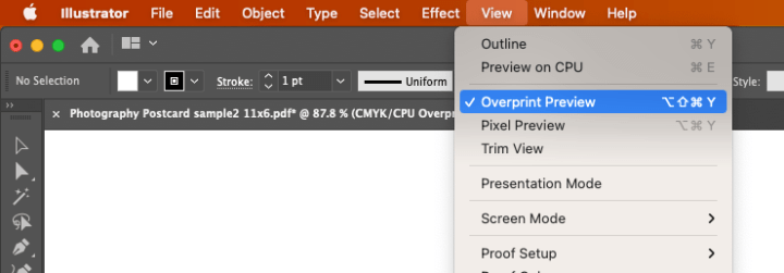
If you are working in Adobe illustrator you can also check for overprinting errors there. Select view and Overprint preview to see colors that will be printed on top of each other.

Photoshop

If none of these options work for you try exporting your project as a PNG. Export your image at 300ppi or better with transparency turned off, or for a cleaner look drop your PDF into Photoshop at 600 ppi, flatten all layers, and reexport without transparency. Then once you have your flattened images drag them back into InDesign and reexport your project as a PDF using only a single PNG layer.

Sometimes white boxes will appear around the text when dropping the PDF into indesign. If this happens this is also a good sign that the PDF was exported incorrectly, and you will have to go back over your preflight check again and check for errors.

A few tip for creating files without errors. . .

If you are having problems with your printer creating boxes around objects try to limit the amount of transparency used.

Avoid using effect modes other than normal when creating objects, and keeping drop shadows and gradient effects to a minimum.

Always check to make sure your project is in the same color space. If your printer is printing in CMYK, then everything in your document should be in CMYK.

Setup a preflight to check your work before exporting.

I hope this information helps you in your creative endeavors and makes the process from your to your printer as smooth as possible.

Happy Printing!

References:

Eliminating the white box effect

https://creativepro.com/eliminating-the-white-box-effect/

Overprinting in InDesign

https://helpx.adobe.com/nz/indesign/using/overprinting.html

Simulate overprint in Acrobat:

https://helpx.adobe.com/acrobat/using/previewing-output-acrobat-pro.html

Simulate overprint in Illustrator:

https://www.printingforless.com/blog/graphic-design/turn-on-overprint-preview-before-printing/

Preflight:

https://indesignskills.com/skills/preflight-indesign/

How to make your printing project a success

Crisp Lines

Please do not use Adobe Photoshop for your text. Edit photos or add special effects to your design in Adobe Photoshop, then place the artwork into your application to add the text. This will give you sharp crisp graphics on your project without having it look fuzzy. Use Adobe Illustrator or another vector program like Adobe InDesign, QuarkXpress, or Macromedia Freehand to get clean lines on your line art.

Rich black

Text fonts less than 18pt bold should be 100% black only with 0% cyan, magenta, or yellow. For text heavier than 18pt bold and for large solids it makes sense to use rich black. There are many rich black formulas you can choose from depending on your use case, but for a neutral rich black that works well in almost any scenario we recommend 40% Cyan, 30% Magenta, 30% Yellow, and 100% Black.

Don’t place text too close to the edge of the document

Do not place your text any closer than .25″ (1/4”) to the edge. We recommend a margin of .375″ (3/8″) from the trim line.

Photos

Photos must be CMYK with color mode at 300 dpi resolution.

Images

Convert all RGB images to CMYK color mode to give you the best color. Our equipment can do this for you but results will be better is you do this in Adobe Photoshop before submitting files.


Print a proof and review a proof from your desktop printer

Please take time to print a proof on your desktop printer and review before submitting files. This will help to make sure your files are accurate before submitting them for printing.

Pantone color matching

All monitors are calibrated differently. Inkjet or laser printers use different types of toner and inks than commercial printing presses. Use Pantone PMS values for best results

Newsprint Reproduction

Limitations in registration

Newspaper printing is different than heat-set magazine and book printing. The thin weight and the high-speed nature of newspaper presses produce the alignment of the cyan, magenta, yellow and black plates on press (registration) that is rarely perfect.

Type size less than 9pt should be 100% black. Building small type in color builds will make it appear fuzzy and illegible.

Thin rules should be black. Color rules should be 2pt or thicker.

Use as few colors as possible when making a solid color build.

Dot gain and ink density

Cold-set printing on newsprint has more dot gain than other forms of printing. Ink on newsprint will absorb more and spread more than book paper.

Because of the absorbent nature of newsprint, the maximum amount of ink the paper can hold is less than what other papers can hold. The spreading ink also results in images often looking darker on paper than what your computer screen shows.

Total ink coverage should be 240%. This means the sum of the percentages of cyan, magenta, yellow and black for any one color must add up to 240% or less.

To make sure your file is optimized for newsprint reproduction, use the “North America Newsprint” color preset provided with Adobe Creative Suite CS6 (or newer). This will give you a better preview of the reproduction on your computer screen, and make sure your files use the correct ink densities.